
Top challenges every developer team lead faces

If you’ve ever worked in a team where key performance indicators (KPIs) weren’t measured, you probably had a hard time tracking the team’s performance and progress.
Still, not all commonly used software development KPIs provide you with helpful information. For instance, measuring the number of lines of code per day hardly says anything about the quality of that code.
To get a realistic insight into your team’s performance, you should explore the KPIs we’ll list in this article. These will help you estimate the pace of reaching your goals and assess the quality of the code produced.
So, let’s explore the essential KPIs for running a successful software development team.
Table of Contents
Team velocity, a KPI commonly used in Agile, is an indicator that allows you to estimate the future workload based on the team’s previous performance.
It provides information on how realistic the set goals or tasks are because it measures the amount of work your team can manage during a sprint.
Let’s examine an example chart to see how team velocity is estimated.
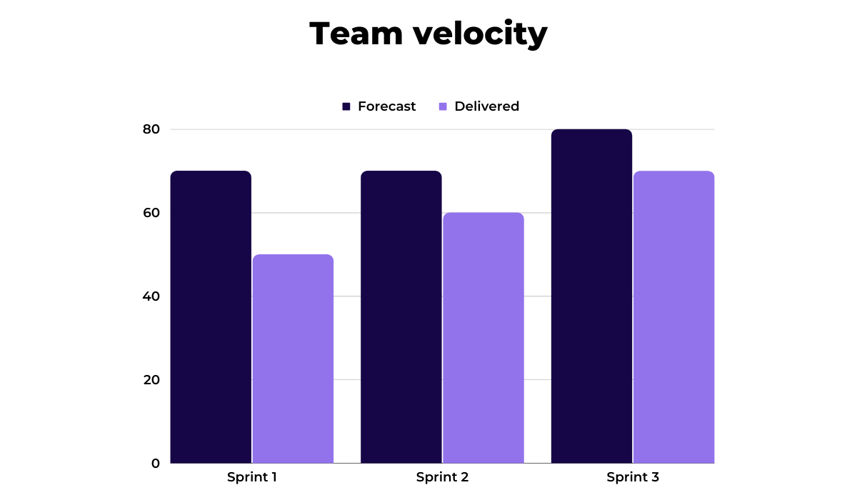
For instance, if your team has completed 50 story points during Sprint 1, 60 in Sprint 2, and 70 in Sprint 3, the average velocity is 60 story points per sprint.
Calculating this allows you to plan the work amounting to 60 story points for Sprint 4.
You should approach this KPI with some caution, though.
As developers assign story points arbitrarily, there’s a danger of velocity inflation. Mike Cohn, an Agile expert, shares the following cautionary tale.
“I spoke with a Scrum Master recently who told me his team had nearly doubled their velocity in only two months. Rather than be happy about this, though, he was concerned.
He knew the team had not suddenly become twice as productive. In fact, he doubted they’d actually sped up at all. Yet their velocity showed they had.”
The source of the velocity inflation was assigning similar-sized stories more story points each sprint.
To combat the problem, developers and managers should strive to keep the point system consistent. That way, you’ll be able to calculate the team velocity realistically.
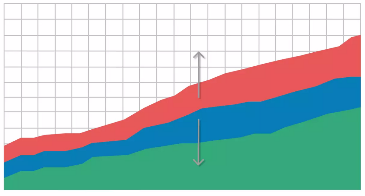
Sprint burndown is another KPI used for estimating the remaining effort-hours during a sprint.
As opposed to team velocity, a KPI measured over multiple sprints, sprint burndown is analyzed for each sprint individually.
It compares the total work done with the planned amount of work.
The charts representing sprint burndown have two declining lines, one representing planned remaining tasks and the other depicting actual task progress.
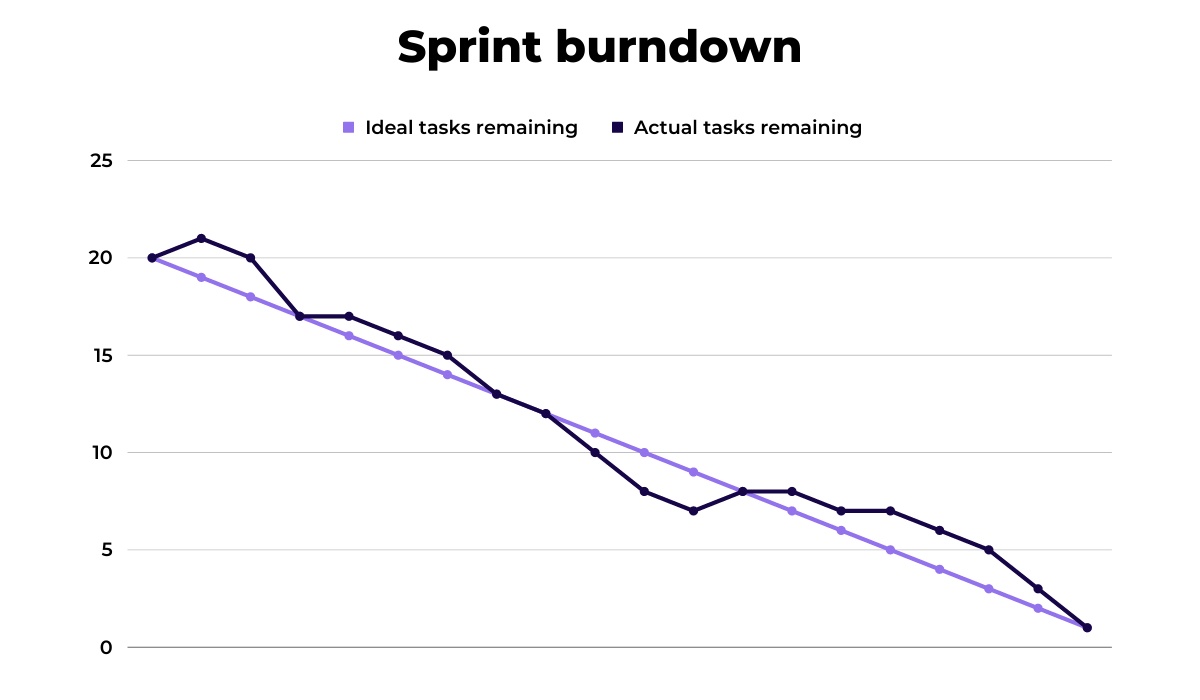
Ideally, the two lines would overlap. However, in reality, tasks are rarely carried out at a planned rate, which is why keeping an eye on a sprint burndown chart is helpful.
If you notice a significant divergence between planned and executed tasks, you will know tasks are not done as planned. That can be a good or a bad sign, depending on which line positions higher, in other words, on whether your team is completing the tasks ahead of time, or lagging behind.

Get unreal data to fix real issues in your app & web.
In case you don’t have enough time to devise graphic representations of the work to be done, you could use a premade template, such as this one, provided by AutomateExcel.
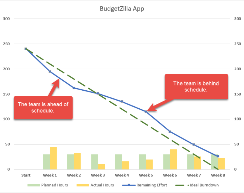
The Excel template is completely free. You can download it, enter your data and automatically generate a convenient sprint burndown chart.
All in all, sprint burndown is an indispensable KPI for software development. It helps you track the team’s progress, and keeps the team informed of any obstacles that arise during the development process.
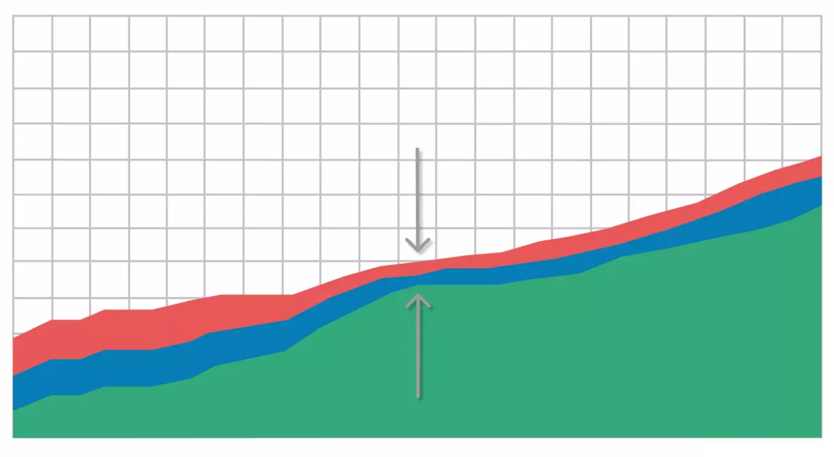
Think sprint burndown, but for all work that needs to be done until the release, not just one sprint—that’s release burndown in a nutshell.
Essentially, this KPI helps you estimate whether the team will manage to release the product by the set release date.
As a development manager, you’re already aware of how vital it is to notify the project stakeholders of any changes in the agreed-upon release date.
Rather than guessing or constantly asking developers for progress updates, you can get more accurate estimates by calculating the release burndown.
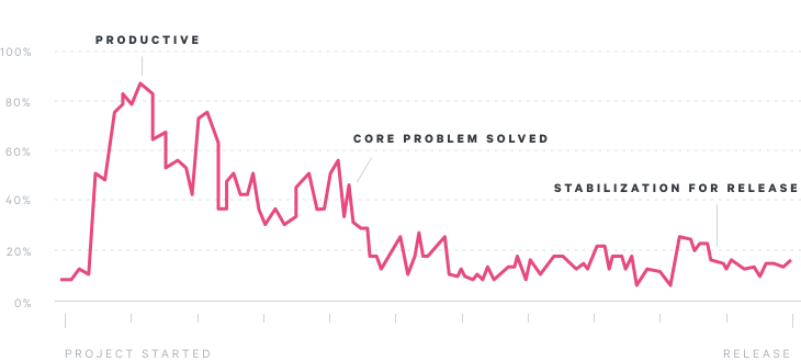
The following image shows an example of a release burndown chart generated by Jira, Atlassian’s work management tool.
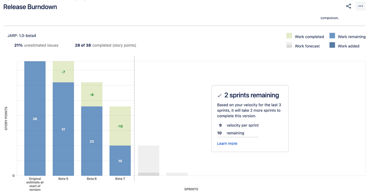
As you can see, the release burndown chart shows the initial estimate and then breaks down the progress after each sprint.
Calculating the release burndown based on the previous activity shows how many sprints you’ll need to achieve a release-ready version of the product.
Sometimes, the release burn chart reveals that the team won’t be able to meet the deadline working at the present pace.
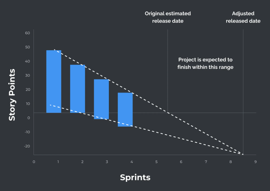
In such cases, being aware of the hindered progress early enough allows you to react on time. You can ask the stakeholders for a deadline extension, or suggest reducing the amount of work if releasing the product on time is the priority.
Either way, calculating the release burndown helps you make informed decisions regarding the development process.
Code coverage, also called test coverage, determines what percentage of code is covered with automated testing.
Tracking this KPI is important because the more code is covered by automated tests, the less time your developers and QA analysts will have to spend testing the app manually.
Additionally, the tests ensure that the bits of code that used to work don’t suddenly break with new changes to the codebase.
Let’s take a look at an example code test from Apple.
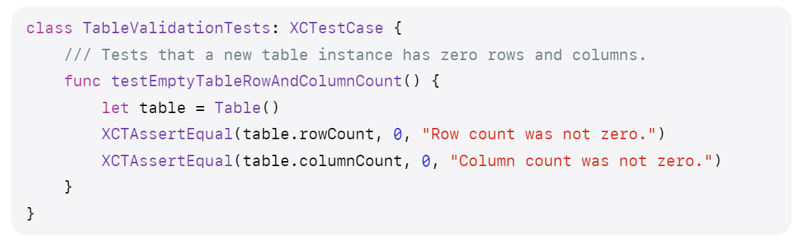
The above code checks the assertion that when a new table is created within the app, it contains no cells and rows.
If there was a bug in the code where empty tables were created with some data already inside, the test would fail without anyone having to run the app manually.
By adding this test, the part of the code responsible for creating tables gets covered, increasing the codebase’s total test coverage.
Here’s another example provided by Apple, depicting code coverage of a file.
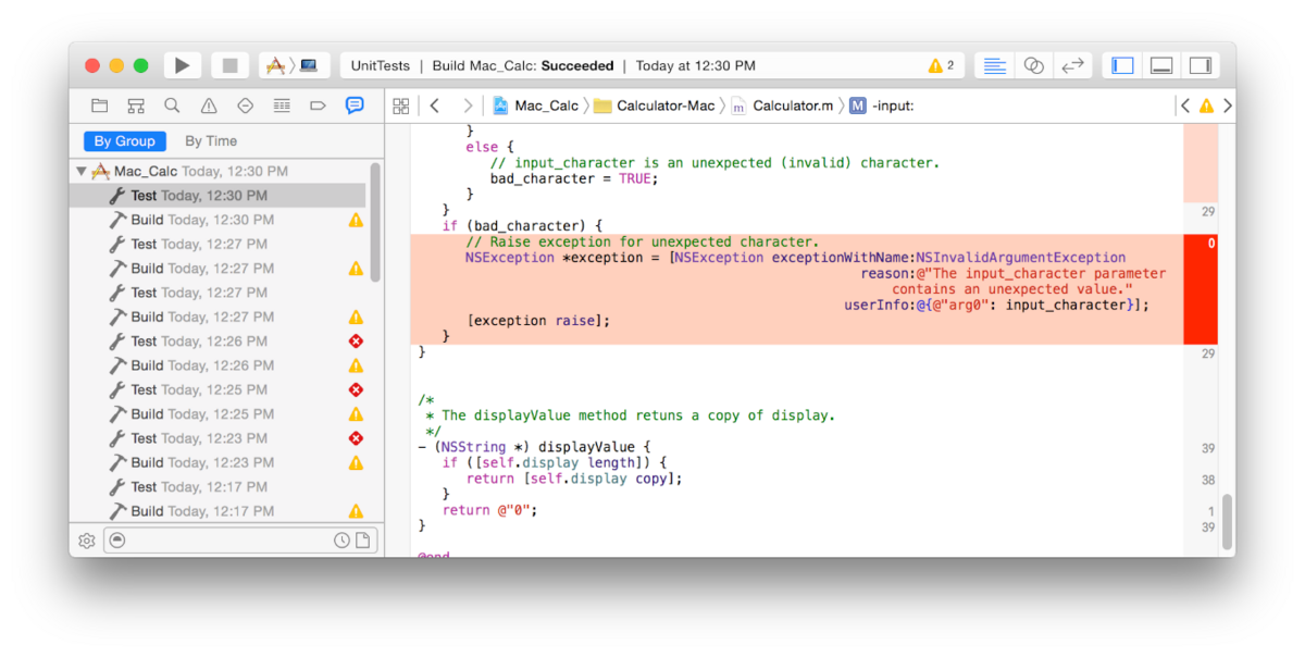
The code highlighted in red is not covered in any test, while the lines directly above it are executed 29 times during testing. Ideally, your code should be covered by tests as much as possible.
However, just because a line of code is executed during a test, it doesn’t mean that the line is thoroughly tested.
This is why there are different ways of measuring code coverage:
Of course, 100% code coverage is not realistically achievable. Still, measuring this metric helps you estimate the quality of your test suite and find the gaps in your automated tests.
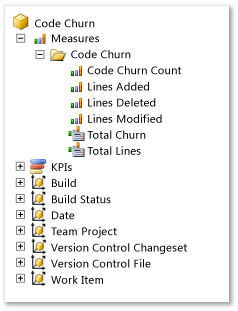
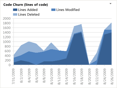
Code churn is a KPI measuring how often a piece of code changes throughout the development cycle.
Although the code will always change to some extent, code churn should be kept to a minimum, especially before the release.
You can look at code churn as a measure of code stability. When you first start a project, there will be many additions, modifications, and deletions to a piece of code, all of which the code churn measures.
As the project progresses, developers may occasionally go back and change a line of code, but they should always strive to write sustainable code that works regardless of other changes.
Here’s Pluralsight’s example of what this KPI can look like.
As the graph shows, there are more adjustments at the beginning of the project. Over time, when the team finds the solution, the number of modifications needed reduces.
Now, let’s look at Microsoft’s example to compare two possible situations.
As you can see, the code here doesn’t stabilize with time. If the final days shown on the Microsoft chart were the end of the project, the end product wouldn’t be secure enough, as more code changes lead to more potential bugs.
Therefore, tracking code churn rates is vital because identifying the spikes in code changes allows you to see if there are any problems with the app architecture or with coding and testing practices.
Cycle time is a software development KPI originating from manufacturing. It measures the total time you need for a task from start to finish.
In manufacturing, you can determine the time elapsed more precisely because automatization enables uniformity in production times.
However, in software development, there isn’t such a thing as the time needed to implement a feature. This is why the cycle time KPI relies on average times for tasks of similar categories.
The following image shows an example of a cycle time measurement provided by LinearB, a workforce analytics platform for software companies.
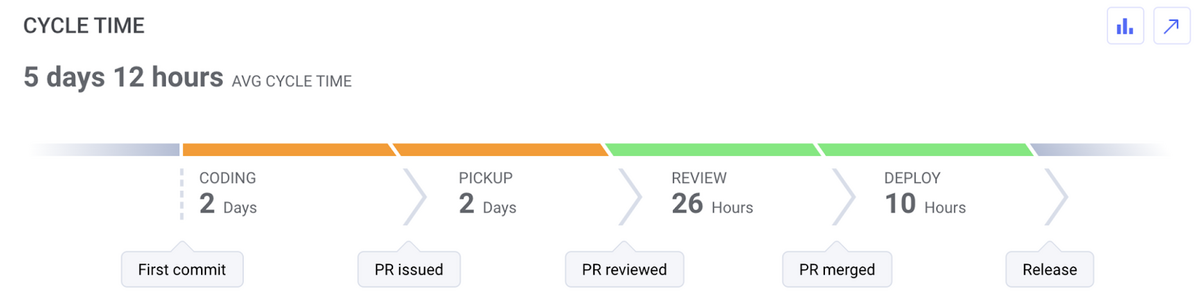
The task shown in the image has taken five days and 12 hours to complete, including all steps from coding to deployment.
While you can calculate the time elapsed for doing simple tasks that are often similar, such as coding a login screen, calculating the cycle time for more complex tasks is more challenging.
For instance, the time needed to code a feed significantly varies by platform. Because of that, you could track that task each time your team does it across different projects so that you can calculate an average cycle time.
That way, you’ll be able to gauge the efficiency of your software development process and also estimate the duration of future tasks.
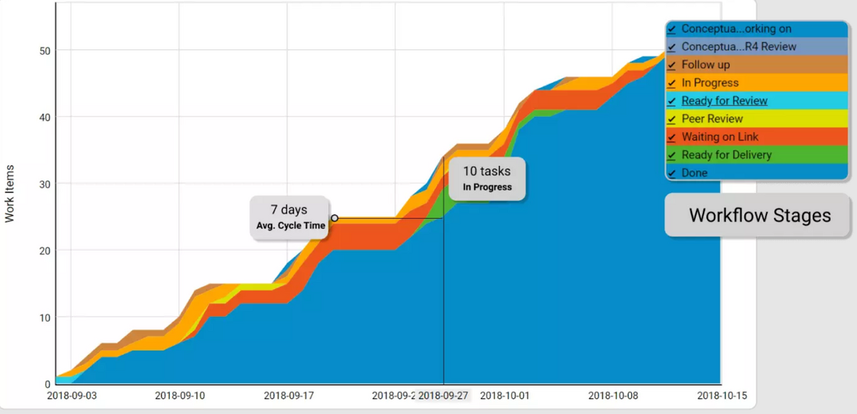
Cumulative flow diagrams help visualize tasks and their current stages within the entire project.
This complex tool allows you to see how your team is carrying out tasks and gauge whether they’ll be able to meet the deadline.
The y-axis of a cumulative flow diagram represents the tasks the team is handling, and the x-axis represents the time frame.
As the number of tasks cumulates as the project progresses, the band showing the tasks is always supposed to go up.
Here’s an example of a cumulative flow diagram from Kanbanize, an agile management platform.
A great advantage of tracking cumulative flow is that the diagram shows you the team’s workflow at a glance.
The way the bands move forward is also indicative of progress.
If you notice the task band narrowing, that means that the team solves tasks faster than you assign new ones. In such cases, you can add more tasks without worrying about compromising the quality of work.
On the other hand, a rapid widening of the bands signifies that the number of tasks coming in is higher than your team can manage, so you should reconsider the work process.
In those situations, it might be a good idea to avoid multitasking or put implementing new features on hold.
So, if you notice unusually skewed parts of the diagram, you may want to inspect the work progress in more detail.
Defect density is another KPI originating from manufacturing, where it measures the number of defective units per the total number of units produced.
In the software industry, defect density measures the density of bugs per a number of lines of code. The number of lines counted is usually a thousand, also known as KLOC, as in kilo lines of code.
The defect density formula is quite straightforward because it only measures the number of bugs against the amount of code.
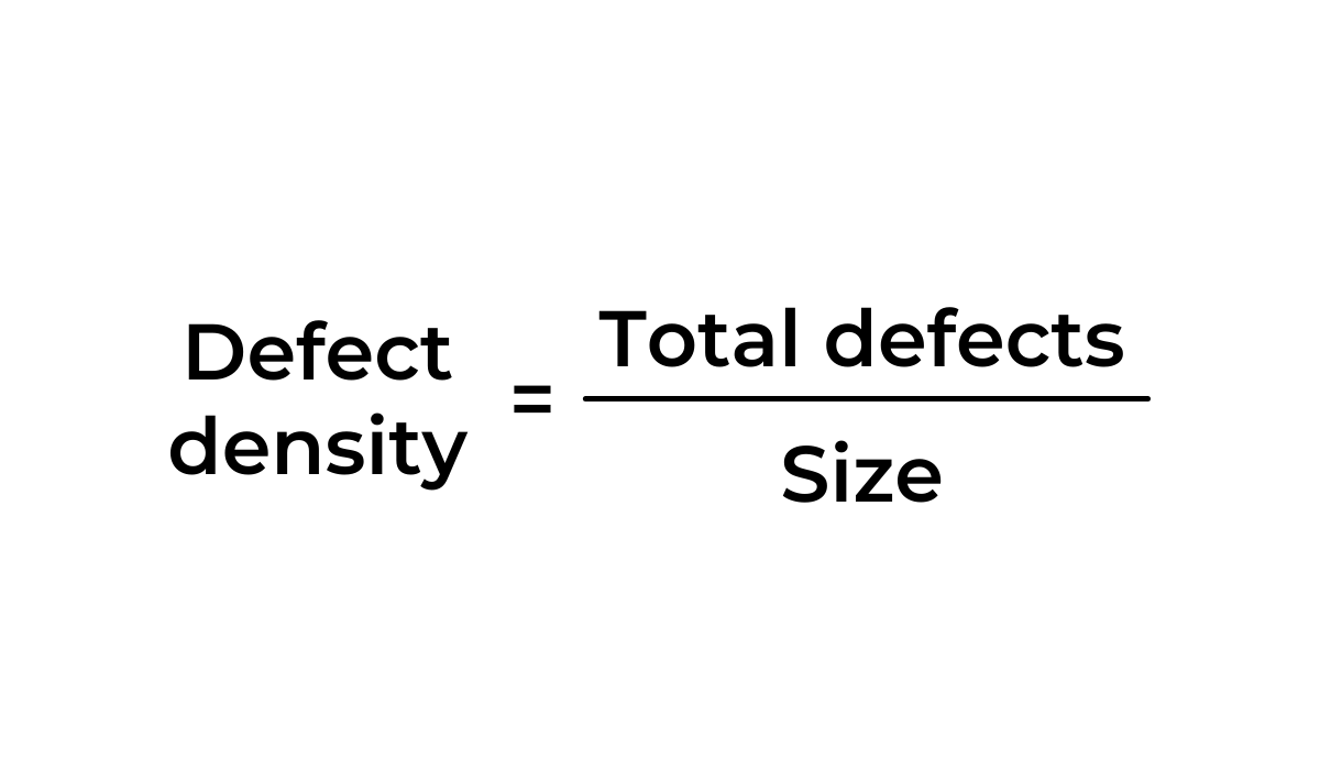
So, if your team has produced 30 bugs per 1000 lines of code, you have a defect density of 0.03.
It’s worth noting that an isolated piece of statistics won’t tell you much about the general quality of code.

Capture, Annotate & Share in Seconds with our Free Chrome Extension!
To leverage the defect density calculations, you should track bugs consistently and compare each result to previous findings. If you find an increased number of critical bugs per KLOC, you should focus on testing and reduce the pace of implementing new features.
Seeing that bugs are an inevitable part of the development process, you need an effective tool to handle them. If your devs could do with a solution for bug tracking, you could look into a bug and crash reporting tool, such as Shake.
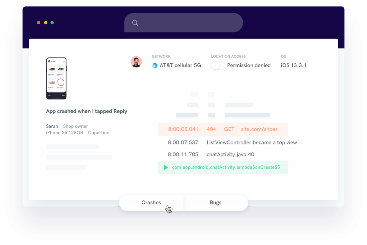
Shake lets you quickly and easily report any mobile app defects.
Using Shake, devs and QA testers don’t have to spend much time describing what had happened before the bug occurred. The platform generates detailed reports, and reporters only have to fill in their comments on errors.
To sum up, calculating defect density can lead to helpful insights. However, the metric isn’t too informative when it comes to the time spent testing, which you can significantly decrease using designated testing tools.
Gathering the data for the KPIs we’ve outlined may take some time. However, the knowledge they provide makes tracking and updating data worth it.
Investing time in tracking and analyzing the time your team spends on certain tasks allows you to make informed business decisions and provide your clients with realistic delivery times.
And if you’re interested in more software metrics, make sure you read our article on ten mobile app metrics development teams should track.
From internal bug reporting to production and customer support, our all-in-one SDK gets you all the right clues to fix issues in your mobile app and website.
We love to think it makes CTOs life easier, QA tester’s reports better and dev’s coding faster. If you agree that user feedback is key – Shake is your door lock.
Read more about us here.

Add to app in minutes

Doesn’t affect app speed

GDPR & CCPA compliant

Unexpected things pop up
Just like bugs in your app or web 🐛 Fix them now with just one reporting tool.