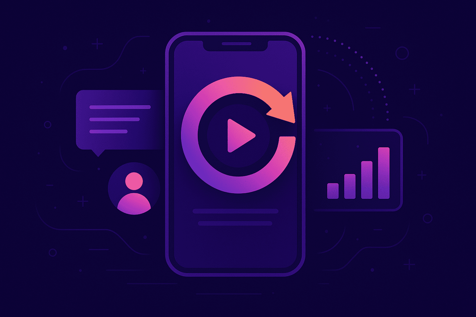
App session replay: What you need to know

Nowadays, it’s a given that consumers use mobile apps. According to a Deloitte study, smartphone ownership has reached 85%.
Furthermore, 63% of users reported being concerned about spending too much time on their phones and consequently trying to limit their usage.
Given how all-encompassing the market is, mobile apps are becoming increasingly popular, with nearly every company releasing one.
However, developing an app isn’t exactly a walk in the park. There are multiple factors to keep track of if you want to ensure a quality user experience.
That’s what this article is for—to show you the most common usability issues and how to circumvent them.
Table of Contents
First-time users won’t intuitively know how to use your app. Each app has a different layout and features, so they’ll have to be walked through the functionalities.
This is called user onboarding—the process of introducing a new user to the app.
It’s essential that your user onboarding is well-executed.

Get unreal data to fix real issues in your app & web.
Simply loading the home screen without explanation or guidance will only frustrate your users, who will likely give up on your app altogether.
Ankit Jain of Infinitus Systems gave the following estimate:
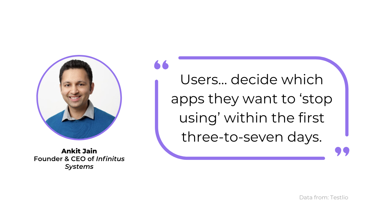
Users can abandon apps as early as three days in. To lower the chances of that, start perfecting your user onboarding.
The first screen on your app should be welcoming and remind your users of the app’s purpose. You want to encourage them to use the application, so reiterate its benefits.
For example, look at this copy:
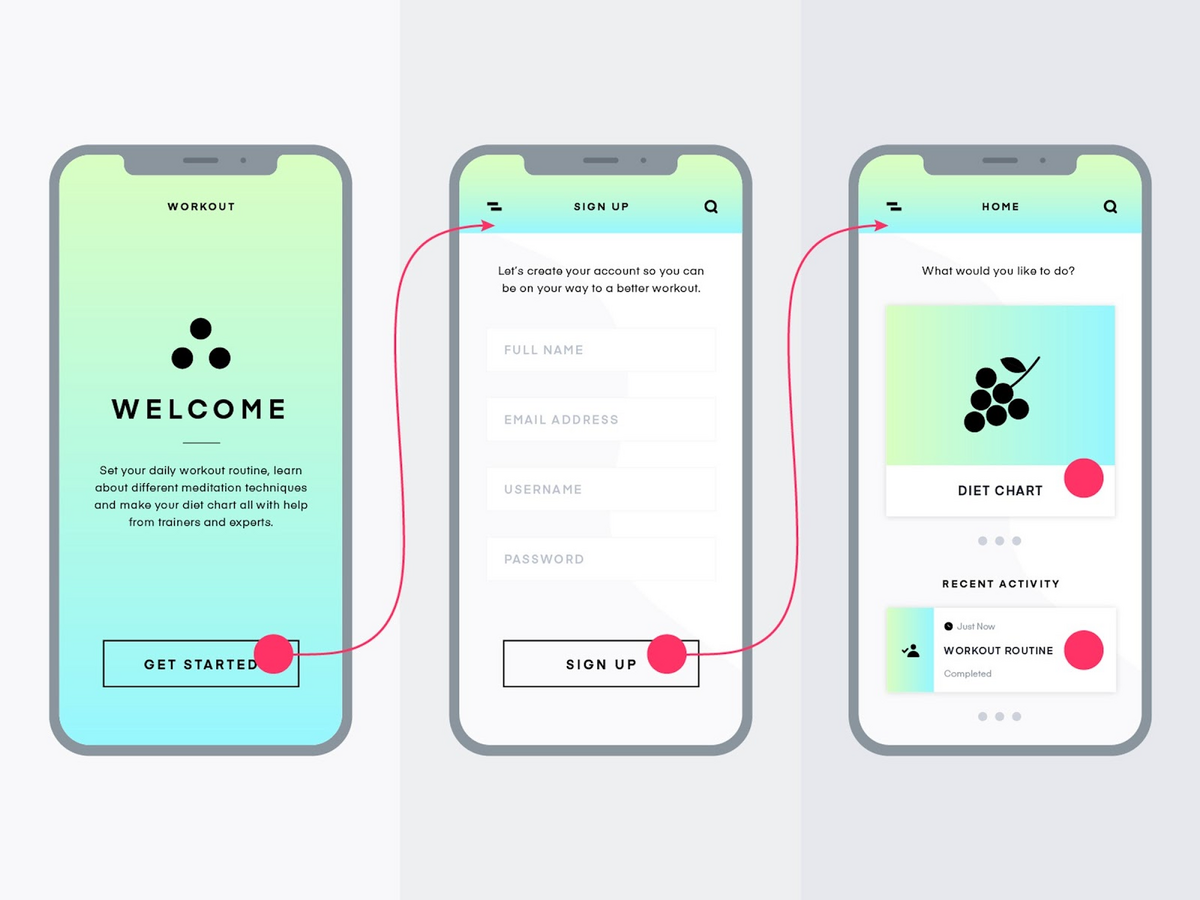
The text on the first two screens subtly reminds users of the advantages the app will bring them, thus engaging them to stick with it.
Furthermore, the user flow is clean and straightforward. Users know exactly which buttons to click on to advance through the app.
However, the real potential for quality onboarding is on the final screen.
Although you want to educate your users, it’s important not to overwhelm them and force a product slideshow. Instead, users can learn by doing.
The perfect setup for the third screen would be for users to click on a feature that interests them and then receive a brief explanation.
That way, users are in charge of their onboarding and learn about features relevant to them at their own pace.
Just as you can overwhelm your users during onboarding, the same can happen with your visual interface once they start using the app.
If your screen is full of visual elements, you’re essentially bombarding your users with information, making the screen feel cluttered and disorganized.
Users will struggle to identify what features do what and grow frustrated.
Just look at the image below:
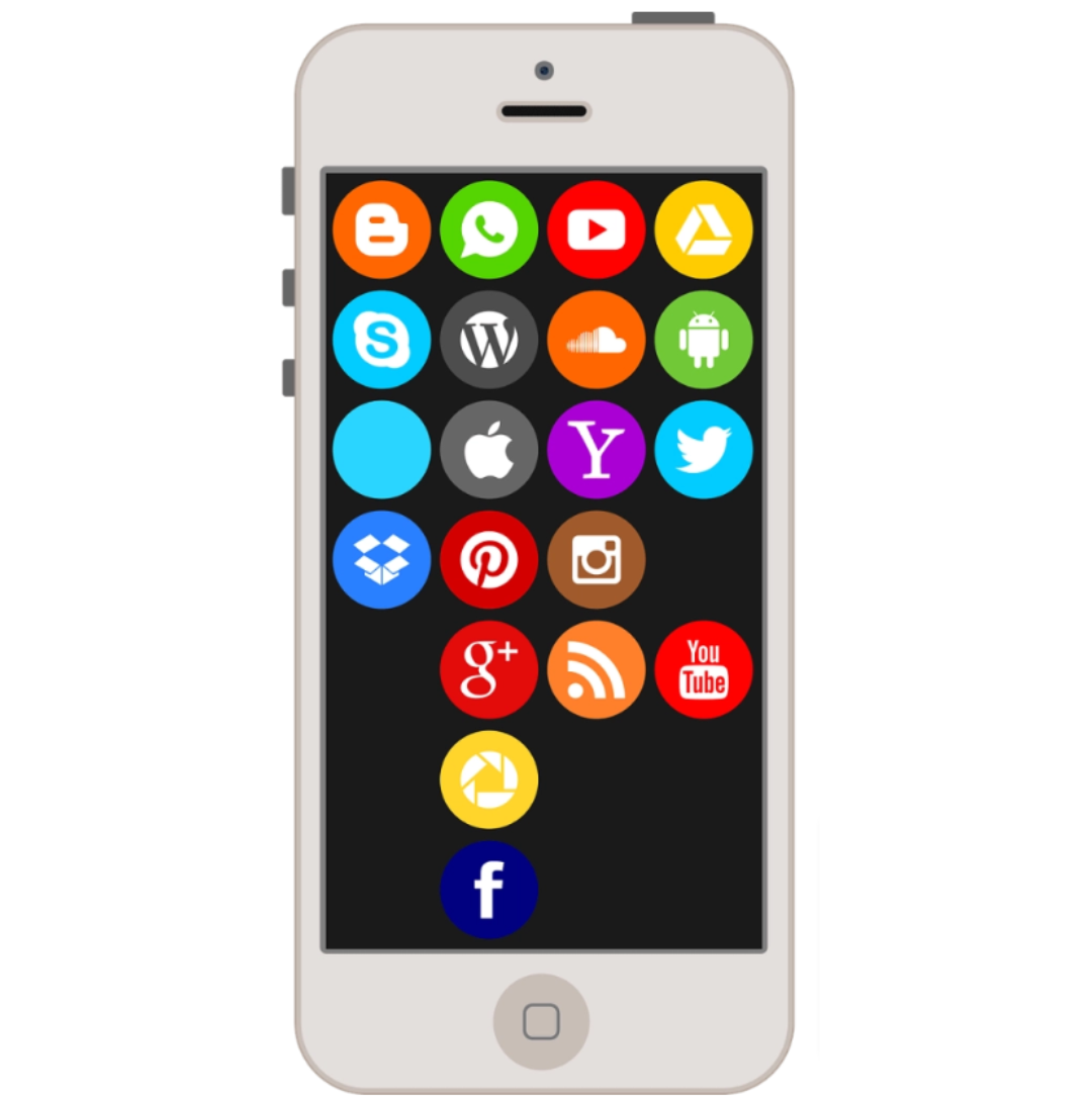
The presence of so many visual elements makes focusing on one specific image challenging, resulting in a frustrating experience.
One way to ensure this doesn’t happen is to utilize the design tool Origami Studio.
This resource can preview your design prototype on a simulated or real device, allowing you to see how the design appears on a mobile screen.
The tool even allows you to choose the preview’s mobile model:
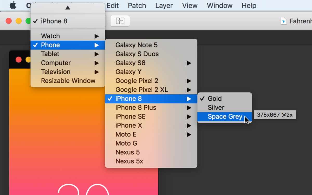
With this feature, you’ll have a real-life preview, making it easier to determine how cluttered the screen is.
If you do find that there’s too much going on, a great tactic to declutter the interface is progressive disclosure.
This design pattern enables you to show only the information the user needs at that point in time.
However, as the user interacts with the app, more and more options (previously hidden) start to appear.
Here’s a classic example of progressive disclose:
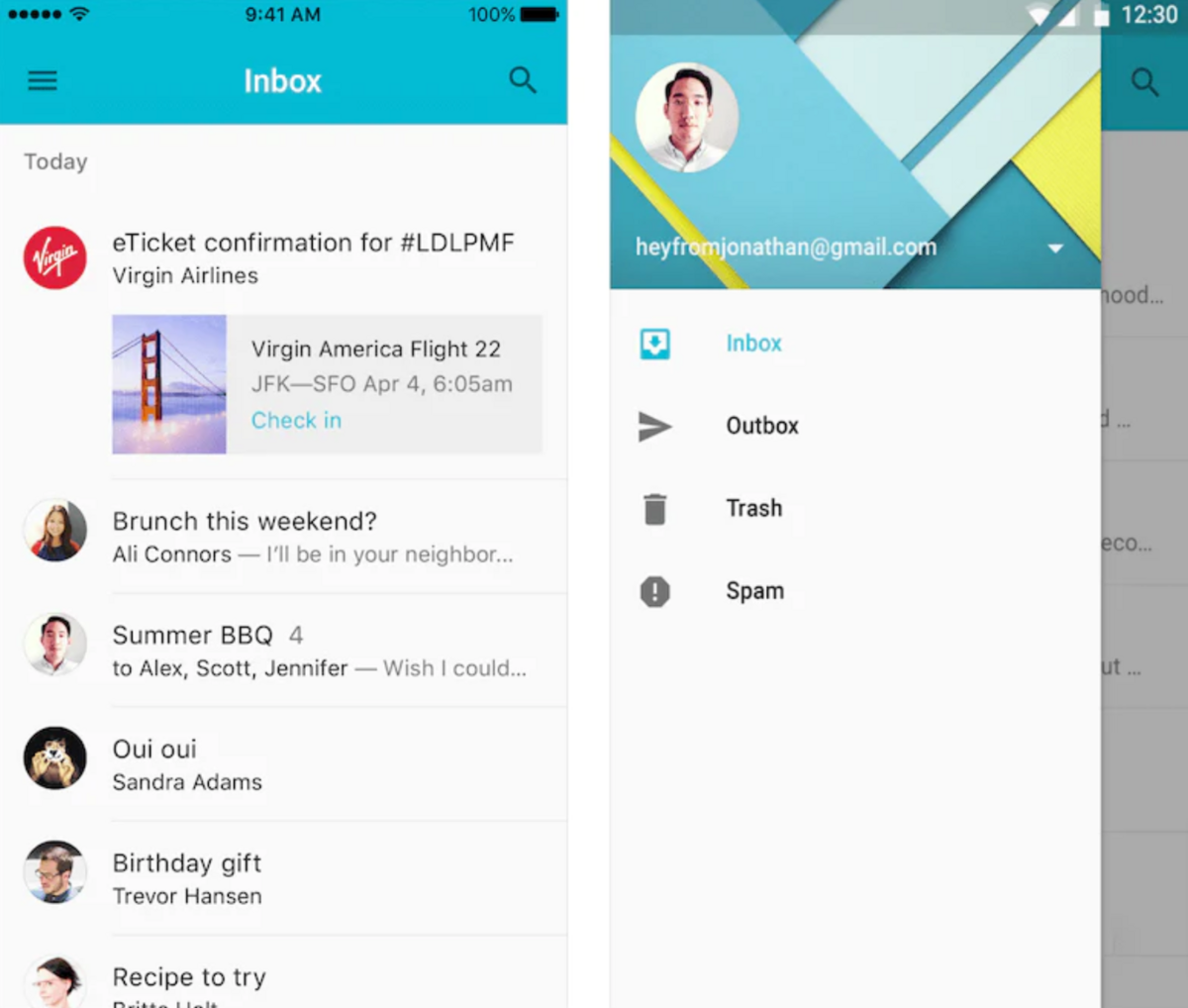
The user must first click on the hamburger menu in the upper left corner of the screen shown on the left before they can interact with the inbox, outbox, and other icons.
In short, the principle of progressive disclosure ensures that these more advanced options appear only when the user specifically requires them.
They don’t clutter the initial screen, allowing for a sleek and streamlined display.
A mobile app should be intuitive. Users should find their way around the app with ease, quickly moving from their home screen to the profile page and back, and across all the other pages.
If your users have to spend a long time finding the screen they want, they’ll probably become frustrated and might even jump ship.
To provide a quality user experience, make sure that your navigation is instinctive.
Here’s an example of straightforward navigation:
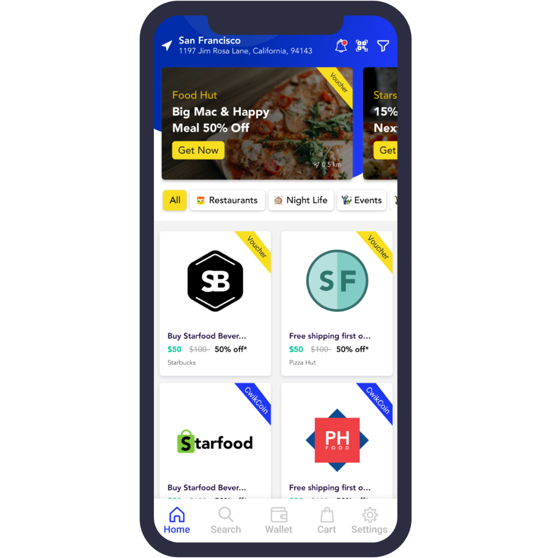
This screen utilizes the bottom tab bar, a standard mobile navigation tool.
Just think of the giants: Instagram, Facebook, and WhatsApp—they all feature a bottom tab bar for navigation on iPhones.
Most users will instantly recognize the bottom tab bar and know how to use it.
Since it’s an element they’ve frequently encountered before, they’ll have no trouble navigating with it and they’ll be able to immediately predict what it does.
If you look more closely at the navigator bar, you’ll see that the home icon is bolded in blue:
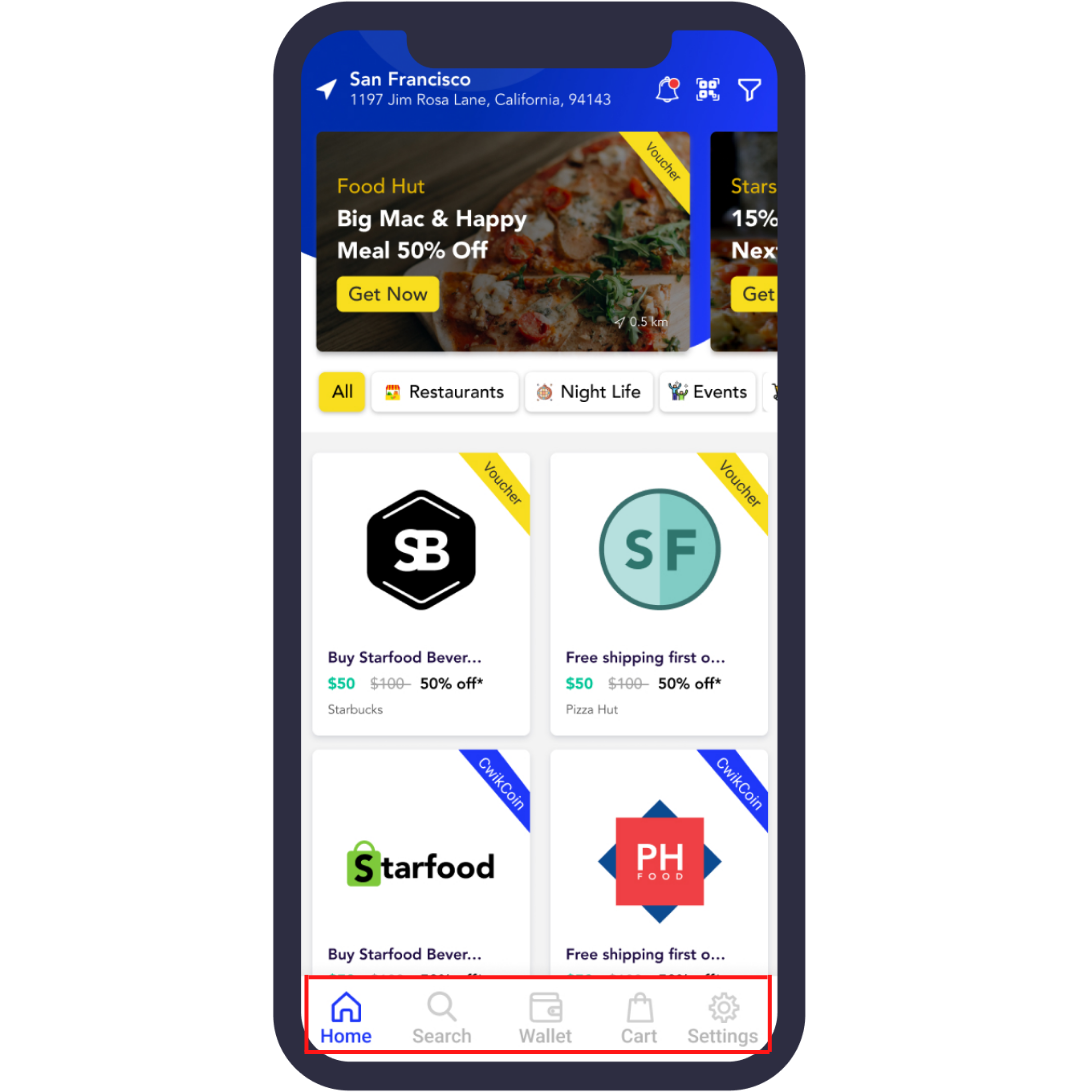
This highlight communicates to the user that they’re currently on the home screen. The screen’s design clearly indicates the user’s location, and they’ll always know which page they’re on.
This is another vital feature, as users can’t traverse the app without knowing where they’re currently located.
On the technical side, Flutter is well worth considering, as this framework is supported by the navigation package AutoRoute.
A declarative routing solution, the package automatically generates everything you’ll need for navigation:
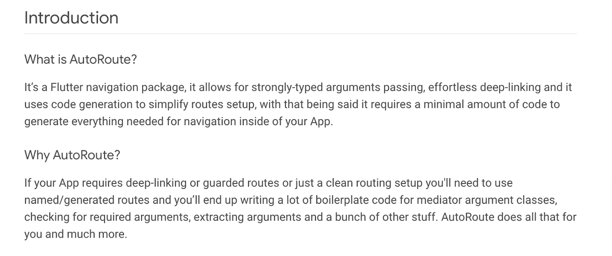
This resource will make building apps with Flutter significantly easier. You won’t have to worry about building boilerplate code.
With Flutter, you don’t even have to declare your route parameters—the library handles them based on your widget constructor.
Few things are more frustrating than straining your eyes to read tiny text or repeatedly tapping on a minuscule button with no response.
Your users shouldn’t struggle to use your app—interaction should be seamless and painless.
One way to ensure this is to size the app’s elements appropriately, making them large enough so that most users can efficiently utilize them.
We suggest starting with simple biology—structure your targets according to the size of a human fingertip.
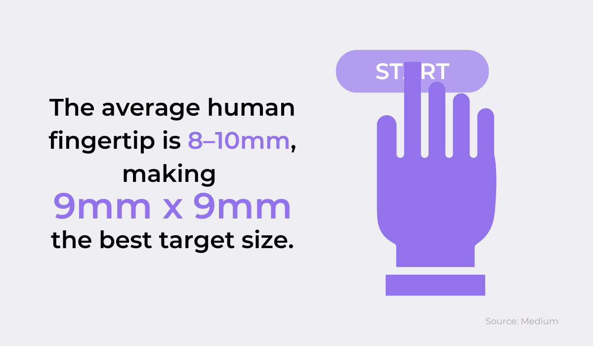
Since most adult human fingertips are between 9 and 10 mm large, the sweet spot is to size your clickable elements around 9mm. Any smaller, and your users will struggle to activate it.
However, that being said, make sure you leave enough space between your buttons.
If they are located too close together, users who want to activate one element might end up interacting with another. You want to provide ample padding between your targets.
If you notice any too-small or too-close buttons in your app, it’s essential to report them as soon as possible and find a more elegant solution.
Otherwise, your users will slowly grow irritated over time.
Shake is an excellent solution for these types of bugs. All you need to do is shake your phone, and a bug report is immediately generated and sent to the developers.
Here’s what it looks like:
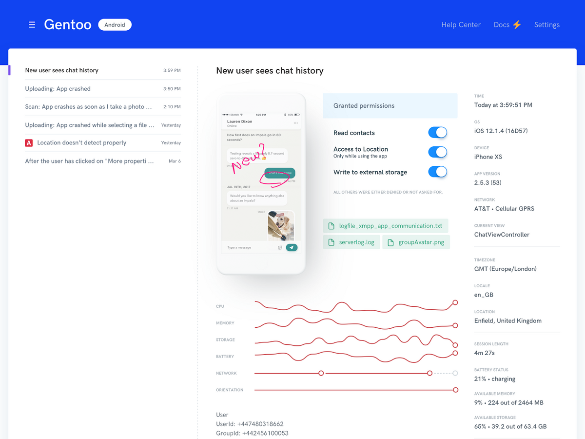
The report contains everything the developers will need: screenshots, screen recordings, steps to reproduce the error, the version of the app and more.
With this resource, your developers will have a visual of the problematic screen and can immediately begin working on an appropriately-sized solution.
Although mobile apps by necessity incorporate scrolling and tapping, it’s recommended to keep these actions to a minimum.
Imagine if the user wanted to view vegan recipes in a cooking app. If they had to scroll for over 30 seconds to find their desired cuisine, this slow, endless action would likely exasperate them.
In short, users will lose their patience if your app requires constant scrolling or tapping.
After all, as Steve Jobs put it:

Therefore, we suggest reviewing your user flows and cutting the number of screens as much as possible. For starters, try collecting as much relevant information as possible on the same page.
A typical example is a shipping page. It hardly makes sense to input the street address on one screen, the zip code on the next, the country on the third, etc.
The fields are interconnected enough to be gathered on one screen, so the user doesn’t have to go through four different screens just to provide their address.
Instagram is a good source of inspiration. They have done a fantastic job of reducing users’ input—stories will circulate automatically without any action from the user.
They have also made it easier to promote and invite purchases through the app.
Before, when Zara (and other retailers) used it for promotion, users would find an item on Instagram, exit Instagram, enter Zara, find the item on Zara, and only then proceed to checkout.
But recently, the app has introduced a shopping option inside Instagram itself:

With this integration, users can find the item on Instagram and immediately proceed to checkout. In other words, they’ve skipped three steps.
Try to follow the same principles. Eliminate any unnecessary fluff, and give your users as many options as you can in-app—don’t introduce anything that encourages exiting.
Let’s revisit the shipping details screen. Although it would be infuriating to input each address component into a separate screen, there’s another scenario as equally frustrating.
Shipping addresses aren’t data that changes often. As a general rule, most individuals remain at one address for an extended period of time.
Since these details are static, it’s somewhat illogical to have the user type them in every time.
With such unchanging data, constant manual input can be exhausting, as users often needlessly repeat information.
To offer a smooth experience, do your best to automate this process.
The easiest method is to offer auto-fill. This functionality allows users to save their addresses and simply select the one they want from a list. Here’s an example:
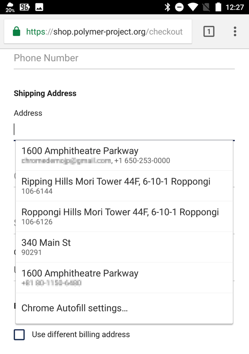
This user can easily choose from several pre-saved addresses. That way, they won’t waste time manually entering all the details but can complete their action in a few clicks.
Another method of avoiding manual input is via scanning. One of the most common use cases is with credit and debit cards.
Instead of having the user laboriously type out the lengthy credit card number, it’s preferable to allow them to simply scan their card.
The process is shown in the image below:

With this mechanism, users won’t have to manually copy long strings of information, which is a potentially error-prone process.
The feature is a failsafe ensuring that the correct credit card data is stored.
Another common source of frustration is improperly implemented gestures.
This can come in multiple forms: an unresponsive button, text that is actually a button, scrolling upwards causing the screen to move upwards, etc.
All these examples deviate from the norm. A button should trigger action, text is supposed to be text, and scrolling upwards typically results in the screen moving downwards.
If your app has these incorrect or unconventional gestures, its usability will be affected, as users won’t be able to interact with the app as they expect to.
One solution to prevent these mistakes is to develop a style guide your team can refer to.
For example, take a look at the CBP style guide:
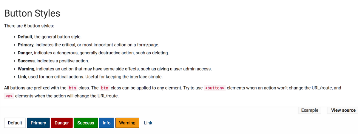
While your developers are building the app, they’ll have a constant point of reference detailing what the buttons should look like and what color they are.
Because of this, they should immediately register if a button is missing any elements or looks like standard text. Similarly, they’ll notice if some of the text looks too similar to the buttons.
In other words, implementing a standard practice will help your team catch mistakes with button and text presentation.
That being said, investing in a bug reporting tool is still handy in case some errors slip through. For example, Shake was used to catch this mistake:
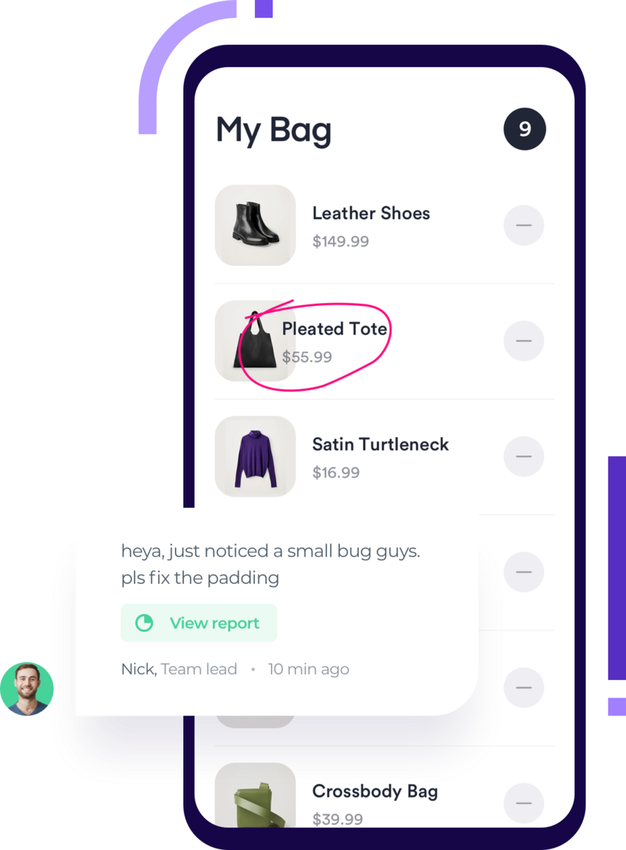
Here the text is too close to the image. However, Shake makes solving this bug (and bugs related to unresponsive gestures) easy.
Simply shake your phone, and a comprehensive bug report will be sent to the developers, complete with screenshots. That way, it’ll be much easier for them to solve the issue.
Although it’s pleasant to be informed about something you’re interested in, no one wants to be constantly bombarded with notifications.
If users receive multiple push notifications daily, that’s already close to the limit.
For a simple method of ensuring you’re not bothering your users, we recommend the following: just ask them.
Take a look at this example:
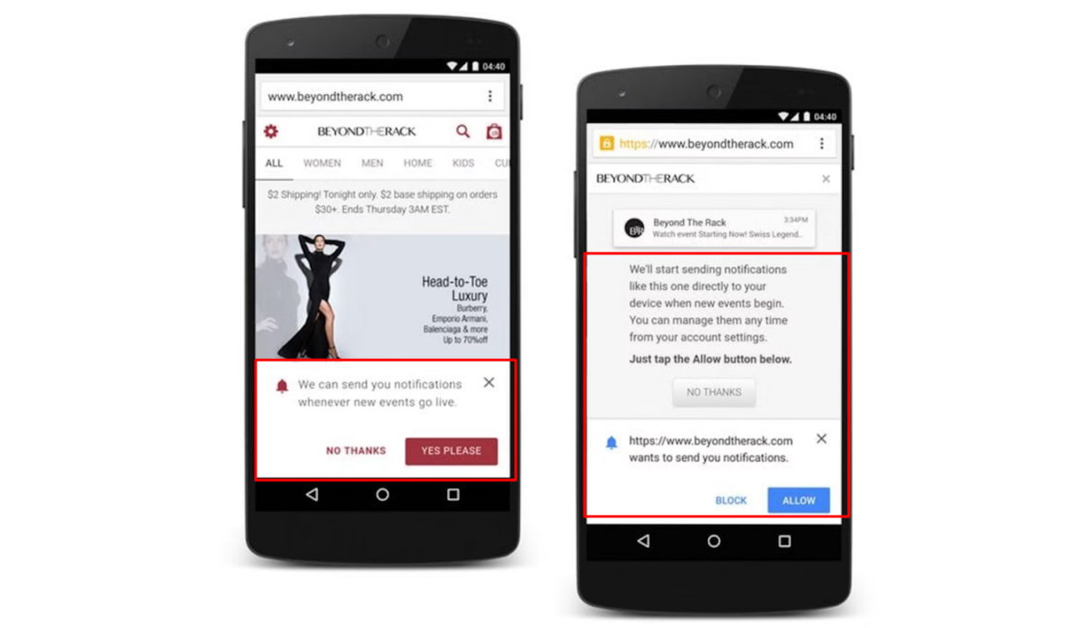
Beyond the Rack was straightforward in its approach. They asked their users if they’d like to be notified about events and offered an opt out option.
There were no configurations without the user knowing.
Furthermore, if the user does consent to notifications, Beyond the Rack clearly explains how to change these settings and even offers one final no thanks option.
The user controls their preferences, which ensures that no notifications are unwelcome.
Another strategy for notification optimization is to create notification groups. In other words, only certain users will receive certain notifications, depending on their activity and interests.
For example, if your app is fashion and beauty-orientated, you could tailor your notifications about a makeup sale only to those users who have purchased over three makeup items.
Similarly, if you’re promoting a blog post on summer outfits, it’s best to send notifications to users who have recently purchased light clothing, indicating they’re in a warm climate.
This is how this feature looks in Buildfire, an app builder:
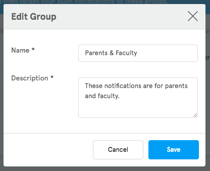
With this approach, you’re not bothering any of your users with information irrelevant to them. Instead, you can rest assured you’re communicating content the user will care about.
When building your app, there are several factors to keep your eye on to achieve quality usability.
Firstly, ensure your user onboarding is well-executed, and tailor your notifications so they’re not too disruptive.
Furthermore, you don’t want your visual interface to be too cluttered, and your functional elements should be appropriately sized.
It’s also important to keep navigation easy and monitor that your gestures are correctly implemented.
Finally, keep user input to a minimum—you don’t want users manually filling in data so much that they get tired of your app.
Follow these tips, and you’ll have avoided the most common usability issues, making for a seamless, painless app experience.
From internal bug reporting to production and customer support, our all-in-one SDK gets you all the right clues to fix issues in your mobile app and website.
We love to think it makes CTOs life easier, QA tester’s reports better and dev’s coding faster. If you agree that user feedback is key – Shake is your door lock.
Read more about us here.

Add to app in minutes

Doesn’t affect app speed

GDPR & CCPA compliant