
Recommended
10 in-app feedback tools you need to know about

Collecting quality in-app feedback is a crucial step in the lifecycle of any app.
However, as you already know, gathering it alone isn’t the endgame. It’s the insights drawn from this feedback that truly matter.
Why?
Because precisely they enable you to refine, improve, and optimize your app to meet user expectations and needs more effectively.
The first step is in-app feedback analysis, and this article is your guide to navigating this crucial process.
We’ll delve into five practical and impactful ways to analyze the feedback you’ve collected, helping you transform raw data into actionable insights.
From word clouds to more complex analytical methods, we’re covering it all.
So, let’s dive in, starting with our first method.
Table of Contents
Our simplest method for analyzing in-app feedback is word clouds, as it offers a visually engaging and efficient way to gather user insights.
But what exactly are word clouds?
Simply put, they are visual representations that showcase the frequency of word usage within a given text.
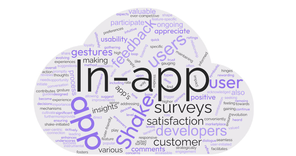
As depicted above, word clouds can quickly highlight the most common themes emerging from user feedback.
The more often a specific word is used, the larger and more prominent it appears in the cloud.
This method is particularly effective when dealing with open-ended survey responses where users are free to go into detail on what they think about some of an app’s features or the app as a whole.
Imagine you’ve conducted a simple in-app survey like the one shown below.
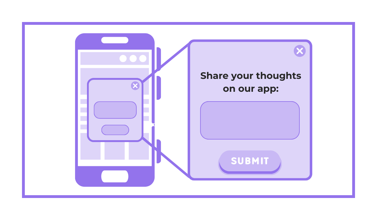
Handling the qualitative data gathered with this survey could be a struggle, especially if you have a lot of it.
However, after collecting responses, you can feed all the text data into a simple and free word cloud generator.
The result?
A visual depiction of the most frequently mentioned topics or issues that can be used to see what users generally talk about at a glance.
For a more specific example, take a look at these two negative reviews about Google Classroom shown below.
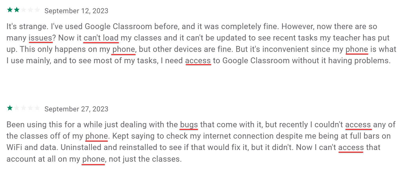
A quick read reveals recurring themes around issues and bugs while accessing classes on mobile devices.
By creating word clouds from these and other similar reviews, the Google team can easily spot these commonalities and start addressing them.
The same process can be applied to positive feedback, helping to identify what users love about the app.
It’s important to note, however, that word clouds have their limitations.

Get unreal data to fix real issues in your app & web.
They excel at showing what topics are most talked about, but don’t provide insights into the sentiment behind the words.
For example, a word cloud might highlight a specific app feature as a common word, but it won’t tell you if people are praising or criticizing these features.
Therefore, while word clouds are a quick and effective way to gauge the main themes in feedback, they should be used in conjunction with other analysis methods we’ll cover below for a more comprehensive understanding of user sentiment and context.
If word clouds offer an efficient, broad overview of feedback themes, manual tagging provides a more nuanced understanding of user sentiments and specific issues.
This method involves reading through each piece of feedback and categorizing it accordingly, allowing for a detailed and context-rich analysis.
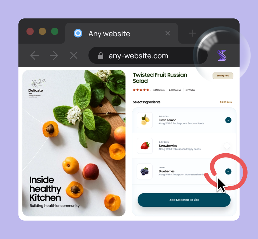
Consider the three feedback examples you could receive through an in-app survey depicted below.
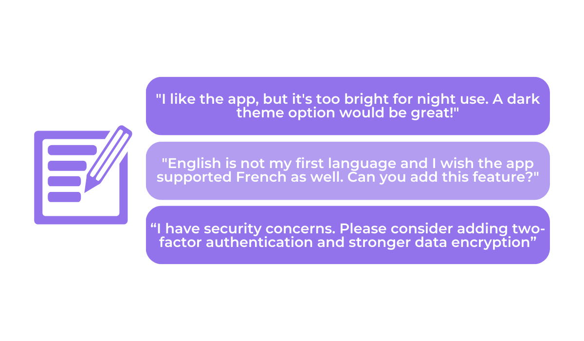
With manual tagging, you would go through each of these and categorize them accordingly.
For instance, all three messages could be categorized under “Feature Request,” and then in subcategories like “User Interface,” “Language Support,” and “Security.”
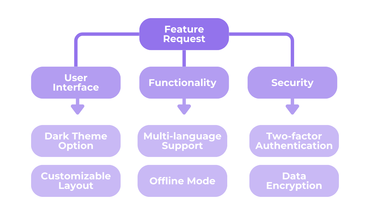
The image above demonstrates how you can structure your categories and subcategories, going as vague or specific as you deem necessary.
What you will gain as a result is well-organized in-app feedback and a clear overview of the number of responses per category, helping you identify which areas need the most attention.
The only downside?
This method takes a lot of time and effort as everything is done by hand.
To streamline this process, tools like Shake can be incredibly helpful.
By integrating Shake’s SDK into your app, users can easily send feedback by shaking their device.
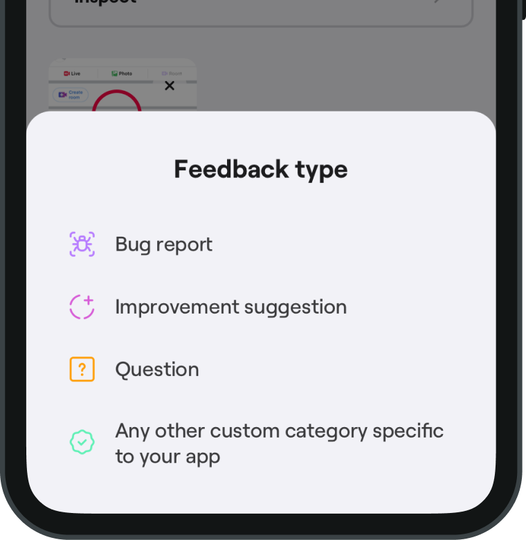
Upon initiating feedback, users are presented with a screen like the one above, where they can select the type of feedback they wish to send.
This pre-categorization by users can significantly reduce the manual effort required in tagging.
Then, users will be taken to an in-app new ticket screen where they can describe any problem they’ve encountered or freely leave a comment or question.
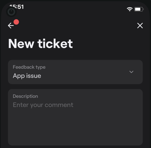
As a bonus, if the feedback is regarding a bug or defect, Shake automatically collects over 70 metrics of essential data, aiding developers in quickly resolving any app problems.
In conclusion, manual tagging is a powerful method for in-depth feedback analysis.
It allows for precise categorization and understanding of user feedback, making it easier to identify and prioritize areas for improvement.
While it may be slower than different methods, using tools like Shake can help make this process more efficient and gain the rich, detailed insights it provides.
Now, let’s turn to an analysis process that can greatly aid in understanding and solving any problems highlighted by user in-app feedback.
We’re talking about the 5 Whys method, originally developed by Sakichi Toyoda for Toyota.
The method is centered around a simple concept—take a problem and ask “Why?” five times to drill down to its root cause.
It’s simple, but can result in some profound insights and solutions.
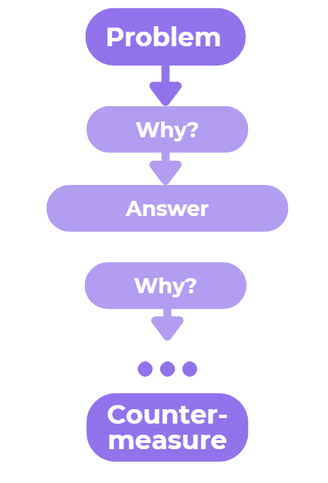
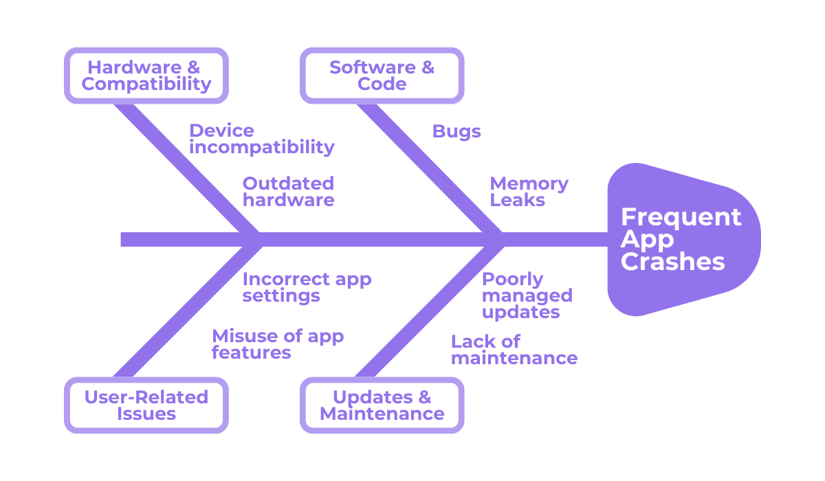
The 5 Whys method is visually depicted above.
It begins with a problem and, through a series of “why” questions, peels back the layers of symptoms to uncover the underlying cause.
This iterative questioning leads to the heart of the issue, paving the way for effective countermeasures.
Consider the following hypothetical example that illustrates how this process works.
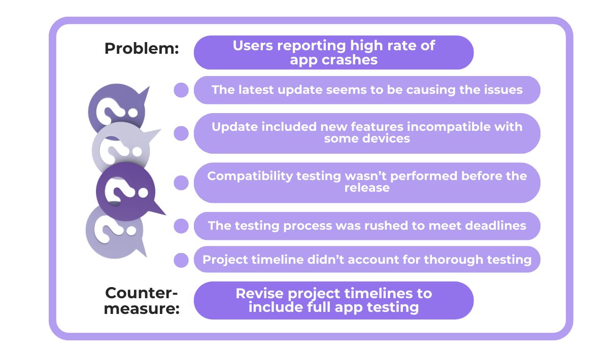
In the image above, we start with the problem of an unstable app with frequent crashes.
By asking “why” repeatedly, we trace the issue back to its source step by step, figuring out the device compatibility problem, and the lack of testing that allowed it.
Finally, we arrive at the core issue—the rushed project deadline that didn’t leave sufficient time for testing, and the obvious solution to prevent this issue from happening again.
The 5 Whys method isn’t about sticking rigidly to five questions, though.
It’s about continuing the inquiry until you reach a logical conclusion.
The number of questions can be more or fewer than five, depending on the complexity of the issue.
What’s more important is following some of the best practices outlined below.
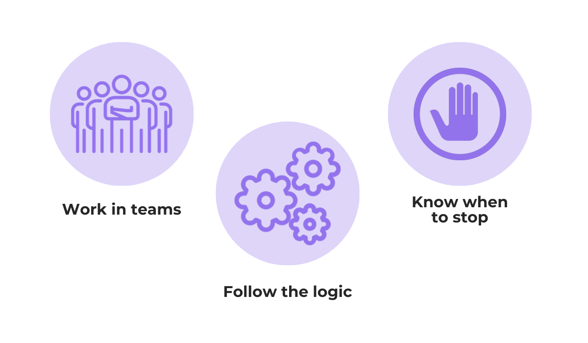
The analysis should be conducted with a team to bring in diverse perspectives and fill in any knowledge gaps, ultimately avoiding making unsubstantiated assumptions.
You should ask the right questions and the answers should be based on facts, and when there is a clear conclusion that can be addressed, the process should be stopped.
All in all, by asking why and methodically exploring each layer of the problem, teams can uncover deeper, less obvious causes and develop targeted, effective solutions.
Analyzing in-app feedback is not just about identifying common issues and improvement opportunities, but prioritizing any changes in a way that optimizes your app effectively.
This is where impact-effort matrices come into play—a strategic tool that helps in deciding which changes or features to implement first based on their impact on users and the effort required to execute them.
You may ask: Why use impact-effort matrices when I have a feedback ranking solution where users rank which change they want to see next?
While user rankings are important, they are only one part of the equation.
The other is the time, resources, and effort your team will need to implement each of the suggestions.
This goal is achieved by using a matrix like the one illustrated below which can be used to categorize feedback and potential changes into four quadrants.
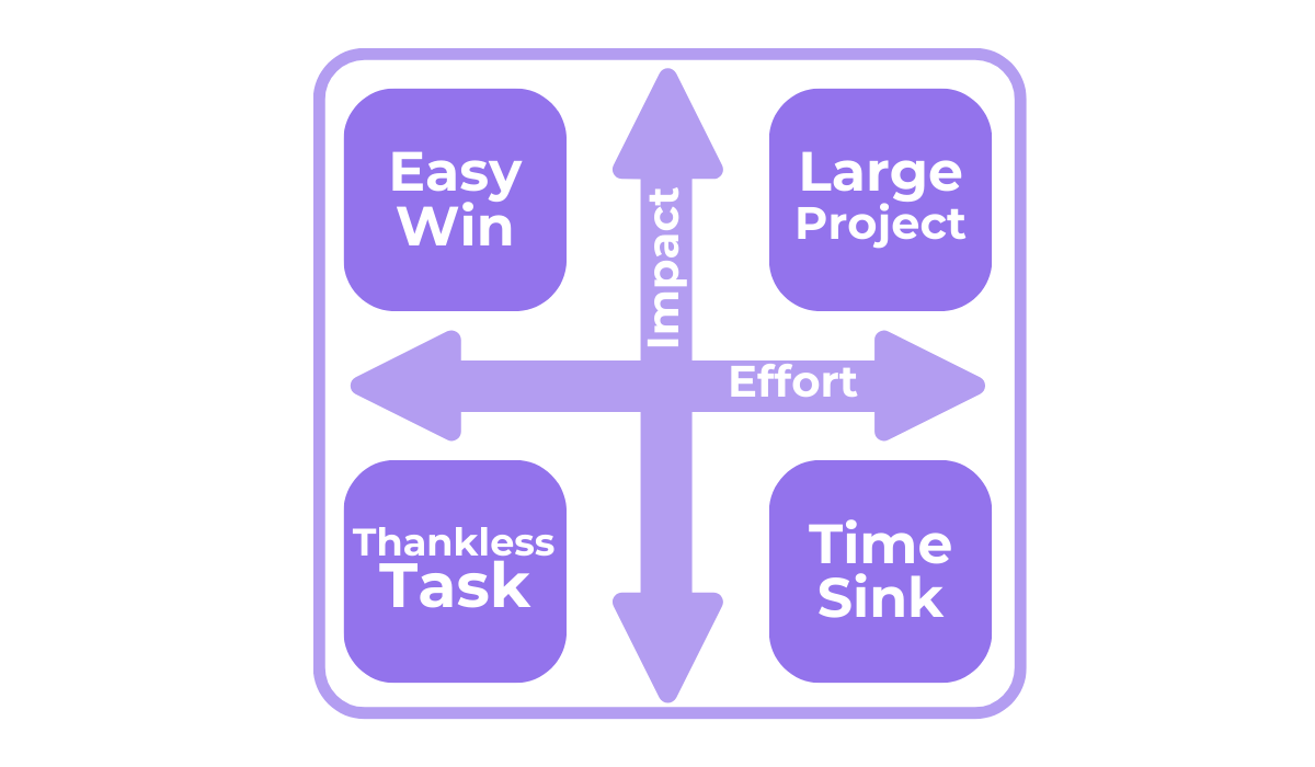
The concept is straightforward: you first want to prioritize changes that will have the highest impact on users while requiring the least effort.
These fall into the “Easy Win” quadrant in the upper left.
An example might be adding a highly requested feature that is relatively simple to implement, like an in-app chat function.
Conversely, the lower-right quadrant, labeled “Time Sinks”, represents changes that require a significant effort but offer little benefit to the user experience.
These might include overhauling a rarely used feature that is deeply embedded in the app’s architecture.
The other two quadrants are the following:
The value of using an impact-effort matrix lies in its ability to provide a clear, visual representation of where your efforts will be most effective.
It helps in making informed decisions about which changes will yield the most significant benefits for your users with the resources available.
So, this strategic approach ensures that development efforts are aligned with user needs and business goals, leading to a more user-centric and efficient development process.
Capture, Annotate & Share in Seconds with our Free Chrome Extension!
Say you’ve decided to work on a high-impact app issue based on the in-app feedback.
Well, doing so often requires a multifaceted approach.
This is where Ishikawa diagrams, also known as fishbone diagrams, become invaluable.
They provide a structured way to explore all the potential causes of a particular issue and are particularly useful when dealing with complex app bugs and problems that have multiple contributing factors.
An Ishikawa diagram, like the one above, helps in visually breaking down the causes of an app’s problem into major categories.
Our example revisits the frequent app crash problem.
While the 5 Whys method revealed a lack of testing as one source of the issue, the fishbone diagram dives deeper, revealing 4 other sources.
The image below shows some of the different major categories where the cause of an app’s problem can be hidden.
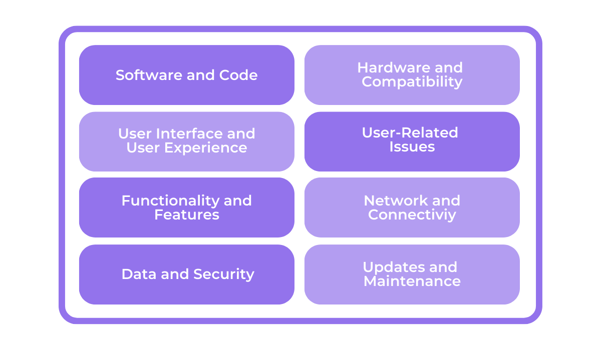
What categories are included in the diagram will vary from problem to problem, and they are revealed only after a detailed analysis of the issue.
What’s more, as you might have noticed in the fishbone diagram, under each category, you can further delve into various subcategories that explore specific elements that contribute to the problem.
Take a look at the image below for an example.
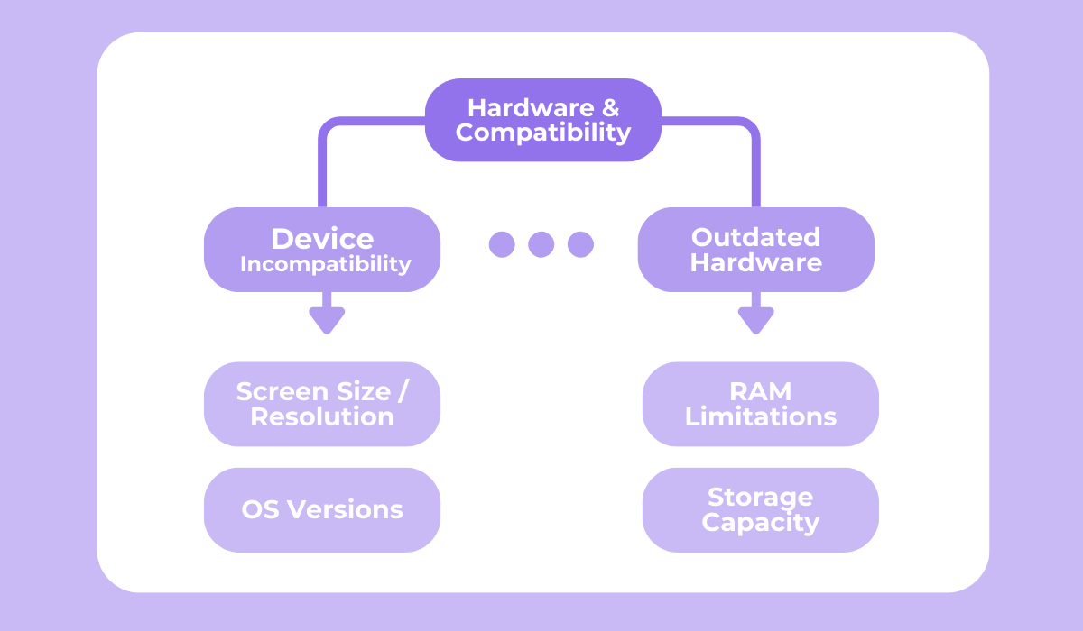
If a solution doesn’t appear after figuring out the subcategories as well, you might have to go even further and focus on specific causes, ranging from screen sizes and resolutions to specific hardware limitations, and more.
This comprehensive approach ensures that no stone is left unturned when analyzing the root causes of issues reported in user feedback.
The process of creating an Ishikawa diagram involves several steps:
Following these steps and creating a detailed diagram is effective because you encourage a thorough examination of all possible causes of a problem, rather than jumping to the most obvious surface-level ones.
Overall, this method ensures that when you address an issue, you’re not just treating the symptoms, but actually curing the underlying disease.
Throughout this article, we’ve explored five distinct methods for analyzing in-app feedback.
From the simplicity of word clouds to the detailed scrutiny of Ishikawa diagrams, each method offers unique insights into user feedback.
Our hope is that you’ve gained valuable knowledge on how to dissect and understand the feedback you receive and extract key insights that drive decision-making.
Armed with these tools, you can now transform user opinions into meaningful changes and enhancements for your app.
Remember, the feedback you receive is more than just words, but a roadmap to continuous improvement and user satisfaction.
So, go ahead, analyze, adapt, and watch your app thrive in the hands of satisfied users.
From internal bug reporting to production and customer support, our all-in-one SDK gets you all the right clues to fix issues in your mobile app and website.
We love to think it makes CTOs life easier, QA tester’s reports better and dev’s coding faster. If you agree that user feedback is key – Shake is your door lock.
Read more about us here.

Add to app in minutes

Doesn’t affect app speed

GDPR & CCPA compliant

Unexpected things pop up
Just like bugs in your app or web 🐛 Fix them now with just one reporting tool.